Build Your Skills
Learn music theory Train your ears Track your tempoRead Now


Get the Newsletter
Categories
- | BeatMirror (11)
- | HearEQ (11)
- | Waay (23)
- | WaayFinder (1)
- Audio (16)
- For musicians (34)
- Guitar (2)
- Music theory (15)
- News (44)
- Startup stories (2)
- Tutorial (4)
Keep in Touch
About Ten Kettles
We love music, we love learning, and we love building brand new things. We are Ten Kettles.
Read more >-
April 1, 2015
Help us find our Waay (…icon)
We need your help! We’ve almost landed on the perfect icon for our new app, Waay. All that’s left is to choose the colours that’ll really make it pop.
Waay is all about music theory for songwriters—it’s about making theory approachable and useful. It’s about learning theory to write songs, not just exams. We’re very excited about it, and want to make sure the icon’s just right!
Take a look at the options below, and let us know which one (or ones) you like in the comments. And don’t worry, commenting is a one-step process around here—no accounts or any of that stuff required.

Option A
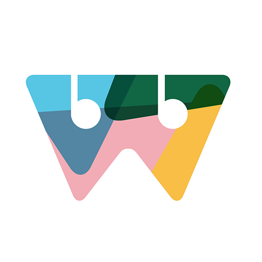
Option B

Option C

Option D
Update – April 2nd
Here are the same icons, as you’d see them on the homescreen:
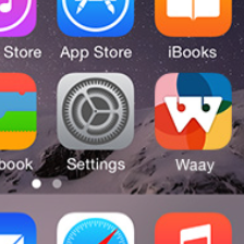
Option A
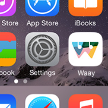
Option B
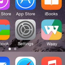
Option C
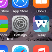
Option D
Option A! The red makes it pop!
A stands out
Option D. Softer colours.
Option C. The more toned down colors allow the foreground W/guitar head/music symbol thing to pop out a little more. The drop shadow seems a little stronger further separating the foreground from the background.
A! 🙂 stands out the most
I like A the best! And D as my second choice (it was close but I think I prefer the brighter colours in A)
A pops out the most but I think C is more subtle and you notice the notes in the design with this one. Good luck!
Thanks for all the feedback! We’ve just put up some additional pics with the icons on an iPhone homescreen too.
I like bright colors on a screen “A” pops for me.
Obviously A! Then, with further updates you can change to C/D options.
Get rid of B, please. )))
Revising the icon for new versions is a very cool idea. Thanks for the feedback!
D for me! I like blues.
You’re on the D team? What do you know about logos?
A all the way!
A is my top choice too